This is part one in a series of deep dives on the various English language manga platforms that are available today. The other parts will be linked here as I write them.
Manga UP! (henceforth abbreviated MU) is an iOS and Android manga platform that carries a wide selection of manga that are published by Square Enix (Japan). It also has a very limited web reader that can only be used for free trials. At launch, MU had a couple major flaws, the most glaring being rampant, sometimes incomprehensible censorship, a 72 hour limit on reading purchased titles, and a mobile gamified monetization model. Some of these have since been addressed, but let's not get ahead of ourselves. First, the main page.
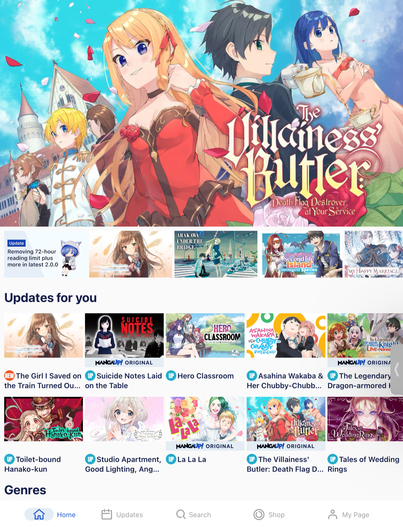
Upon launching the app for the first time, it asks you to agree to their terms of service, and asks if you already have an account or want to start fresh before throwing you into the home page. The app doesn't do a very good job of onboarding you with how to find series, what all the various icons mean, or letting you know how much money you're going to have to spend to catch up on a new series. New series discovery is pretty decent, with a revolving carousel of banner images, and many sections on the homepage to promote newly added or currently trending series. The Updates tab shows what series have new chapters coming out over the next week, and the Search tab lets you do a text search, browse by genre, or just look at the entire list of series that are on the site. We'll get to Shop in a moment, but My Page shows you your reading history and a list of favorited series as well as access to the settings menu.

The settings menu has some basic account management settings, the option to generate an invite code, some data/quality settings and, interestingly, a "Customize Series" option. This lets you decide for each series whether you want it to hide it from the rest of the app or mark it as "stealth".
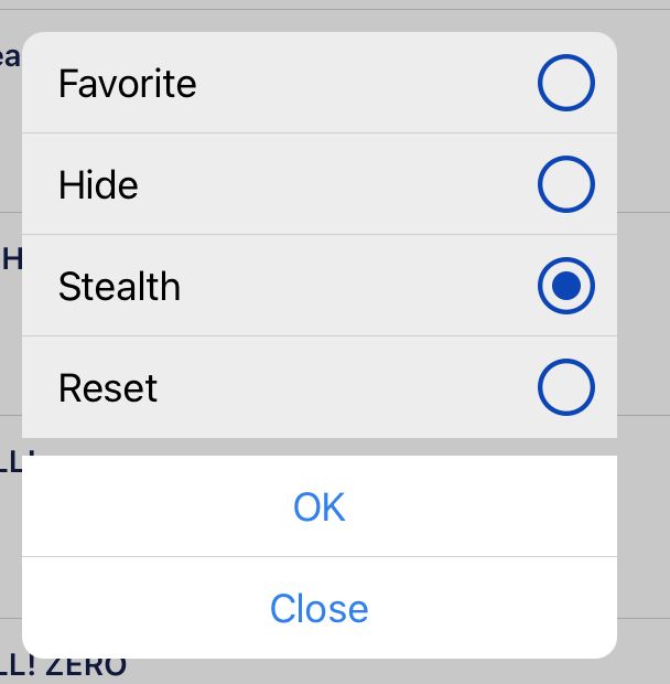
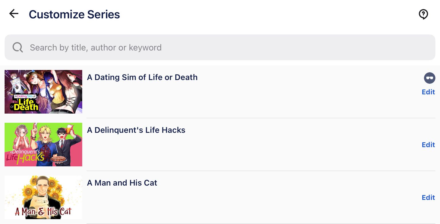
The explanation is buried away in a help menu, but the stealth option lets you remove a series from your read history. MU isn't really designed with any concept of user sharing, so I see limited usefulness for it unless you really want to hide your media consumption from a family member who uses the same device. The "Hide" option is much more useful, allowing you to completely remove a series from the home page and search page, but it could be implemented better. You can't hide a series from the home page or a series page, but instead it requires you to go through the "My Page" screen into the settings menu.
Monetization
MU has a pay-per-chapter model, but it has a very loose definition of what constitutes a "chapter". A chapter in the app is between 10 and 20 pages (a massive spread, honestly), and represents anywhere between 1/4 of a Japanese manga magazine chapter and 2 magazine chapters. These chapters can be purchased with one of three different currencies: UP, XP, and Coin, which can be managed on the Shop tab of the app.

You start the app with 160 UP and 800 XP. UP is replenished every 12 hours (at 5 PM and 5 AM Pacific Time), and you get the full 160 on every refresh, use it or lose it. XP is a "bonus" currency earned by completing tasks like reading specific chapters, inviting friends with your referral code, or as a bonus for making purchases. Coin is a currency that is only available for purchase.
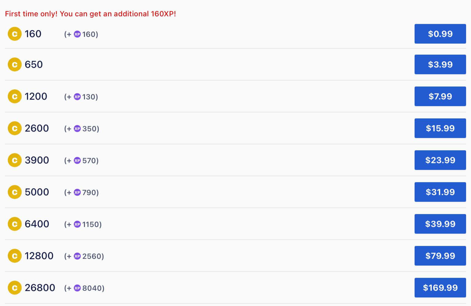
The cheapest coin tier offers a one time (either per platform or per device) bonus of 160 XP, but otherwise you can pay increasingly more money for a larger sum of currency. If this is all hard to keep track of, at least there's one saving grace. Every chapter costs 40 currency apart from the ones marked "Advance" which cost double and can't be bought with UP. Each chapter purchased this way is unlocked indefinitely (until either end of service or until a series is removed for licensing or platform content restriction reasons). Additionally, the first full length magazine chapter of every series (not just the first cut up segment of one) is available for free. This is a nice way to get an idea if a series is worth continuing, but Viz offers 3 chapters for free, which is a lot more telling of where a series is going.
There doesn't seem to be a good reason why Coin and XP are separate. I've seen other platforms separate these types of currencies so they can get around platform restrictions that block users from moving purchases from e.g. iOS to Android, with the paid currency being platform locked and the "bonus" currency being cross platform. However, MU's currencies appear to be fully cross platform, so the three different currencies only serve to confuse.
Running the numbers, the series My Dress-Up Darling currently has about 130 "chapters" in the app. If you have the patience of a saint and the discipline of a monk, you can buy 4 chapters every 12 hours without losing any UP. It'll take you a bit over 16 days to catch up on the series if you don't read anything else. If you're willing to pay, it ends up being a fairly good deal compared to buying on an ebook platform like Kindle. My Dress-Up Darling costs $10/volume on Kindle, while on MU it's 16 chapters per volume for a worst case of $4 per volume's worth of chapters. That's a pretty good deal if you don't care about the magazine cover illustrations and potential between-chapter bonus illustrations and you trust the platform will continue to exist.
However, that's just one series. Each series seems to have its own way of splitting chapters up, so there's no real way to know how many pages you're getting for your money, and whether or not you're getting the best deal. The lack of transparency and all the different currencies makes it a frustrating experience where it feels like they're deliberately trying to obscure how much money you're spending, like a predatory gacha game.
The reading experience
I went to take screenshots of the reader, but when I did, it gave me a pop-up warning me that taking screenshots of the manga is against the terms of service and repeated infractions would result in account termination. So I'll try to describe it with words as best I can.
The reader has a simple right-to-left scroll with pinch/double-tap to zoom, and tap or swipe to advance pages. Turning your device into landscape mode switches from a one page view to a two page view. There's no option for vertical scroll or right-to-left reading, which I personally don't mind but might be offputting for some. There's also a scroll bar on the bottom to quickly scrub through a chapter to get to the page you want. On the top left there's an X to leave the reader, and on the top right there's a comment button where users can leave comments on a chapter and a share button that gives you a canned tweet message with the series title, a hashtag, and a link to the MU website. I followed one of those links, but it took me to a 404 page so I'm not sure how useful it is. Maybe if I used Chrome instead of Firefox or if I was on an iOS device it would've been different.
If you sign up with a Square Enix account, it gets you a bonus 40 XP and starts automatically syncing your purchase and read history across all signed in devices. It all works pretty seamlessly, but the app does have a warning about not loading your account up on a new platform in the middle of a transaction because it might lead to losing your purchase.
One issue I've noticed with the reader is more of a data quality issue. In You Were Experienced, I Was Not: Our Dating Story, there are several two page spreads that don't display correctly (requiring a page turn in the middle of the spread) because the page parity was set wrong.
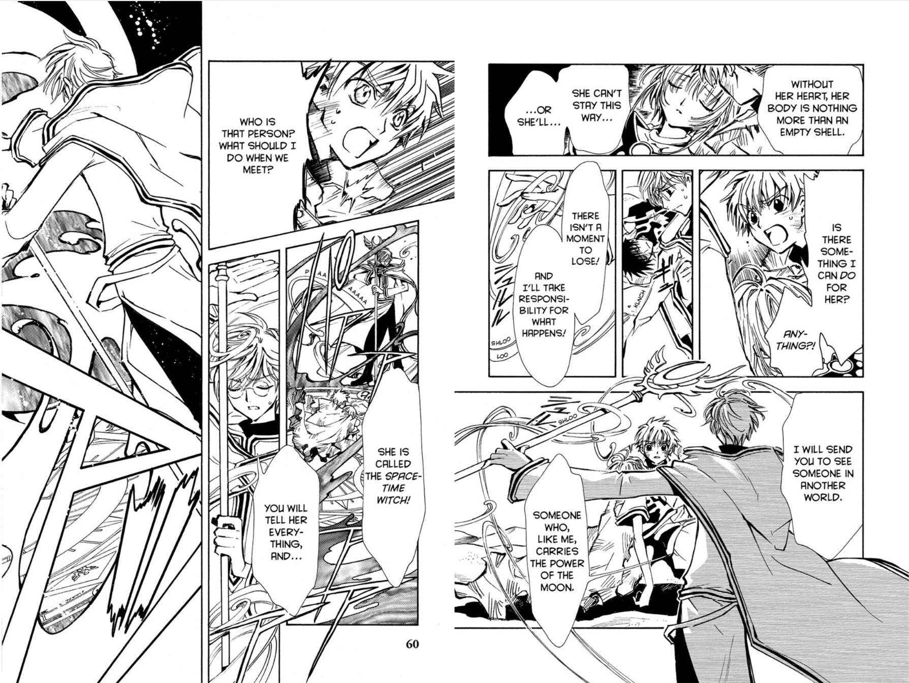
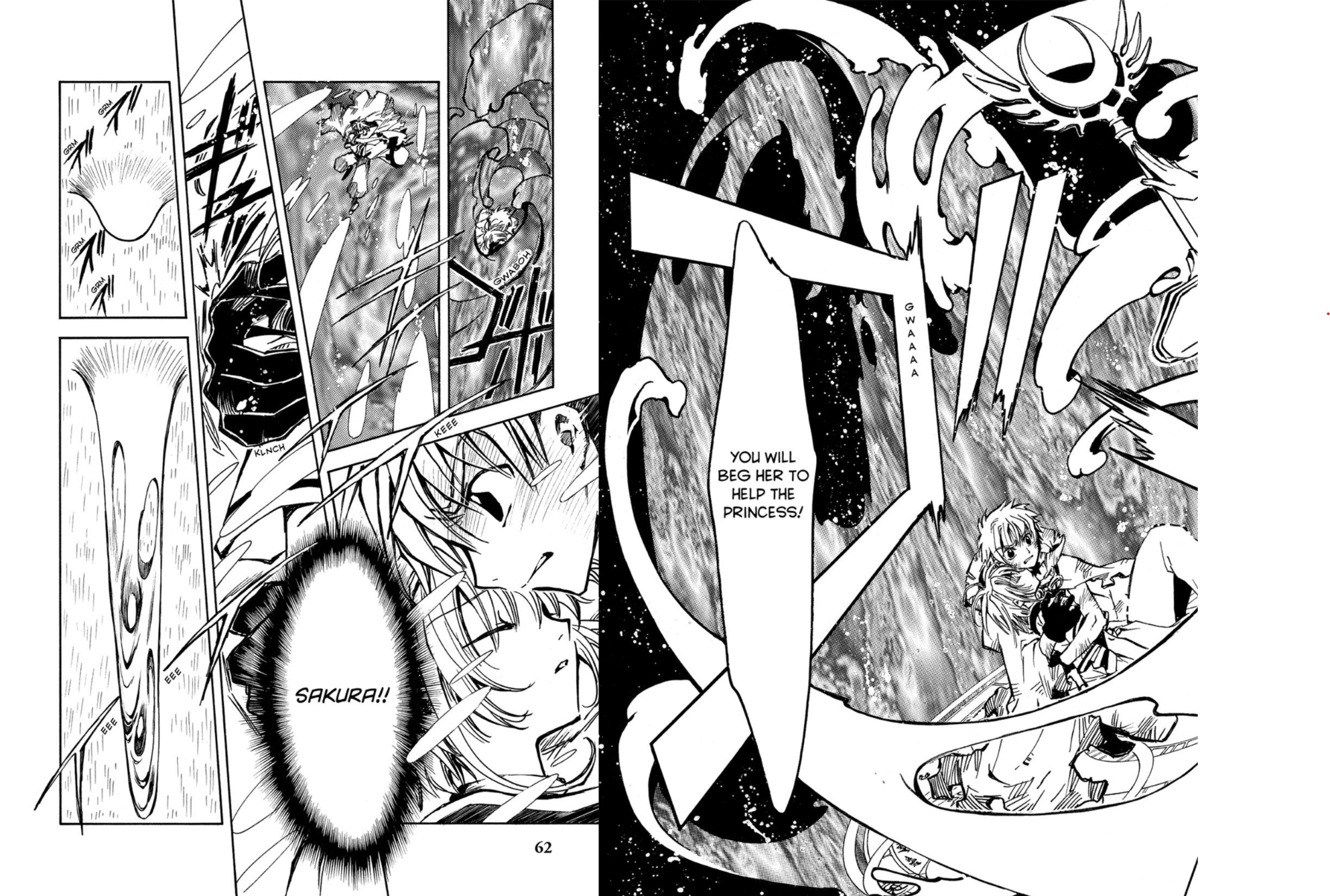
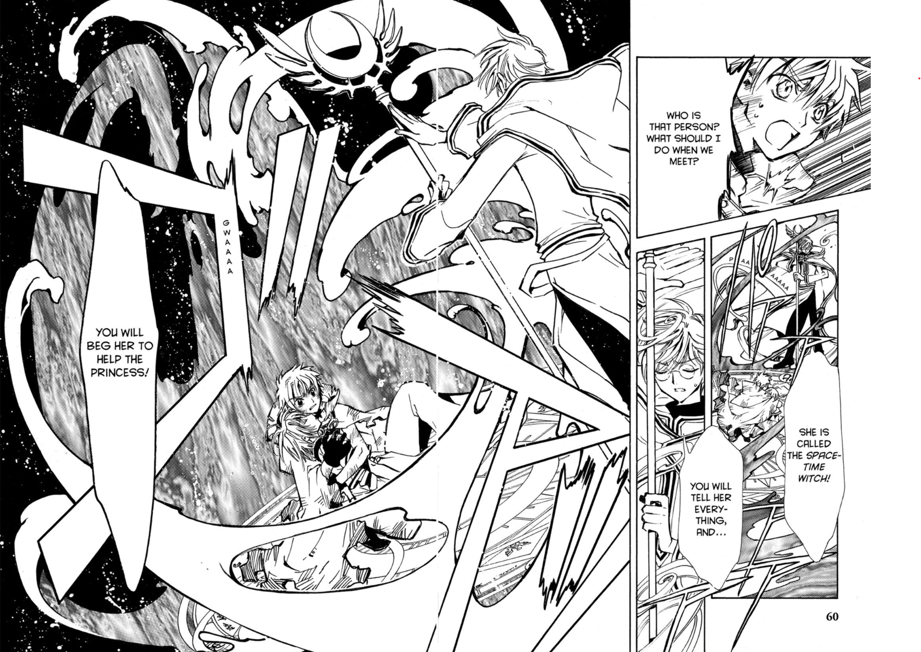
When the parity is wrong, not only are the two page spreads wrong, the gutters that are normally in the center of the fold get pushed to the side, and it could lead to pacing issues. For print published manga, artists draw assuming there's one page on the right, the next page on the left, and the page after that is a page turn away. If an artist, for example, puts a big reveal after a page flip so that wandering eyes don't get spoiled, their deliberate decision is just thrown out the window by an incorrectly configured digital manga app. Thankfully because of gutters, important dialogue shouldn't get split between the two pages, but reading a two page spread might involve either flipping back and forth or awkwardly holding the two pages side by side by swiping half way and not lifting your finger. It's not a great experience and it should've been QC'd before it was uploaded.
As part of the most recent UI update, when you get to the final page of a chapter and swipe to turn the page, it shows you a bar at the bottom telling you the title of the next chapter, how much it costs to unlock the chapter, and your currency balances. A second swipe in the same direction will automatically purchase and advance you to the first page of that chapter. This experience is very slick and unobtrusive, which is why I'm a bit torn. The seamlessness makes it a great reading experience, but it's also frictionlessly separating you from your money. I actually manged to buy 2 chapters marked "Advance" (chapters that are available early to people who are willing to pay more instead of waiting for them to become free) before I realized they cost more and can't be bought with the free UP currency.
Additionally, tapping on a chapter you haven't purchased or swiping from the end of a chapter you've just read are the only two ways of purchasing another chapter. From what I can tell, there's no bulk buy option to unlock all the chapters for a series, so the app really wants you to use their new page turn purchase feature. It's also worth noting that the app does not function offline at all. There are no downloads so no reading on a plane or with spotty internet on public transit. If you launch the app without an internet connection, you just get a notice that the app couldn't connect.
Back in September of last year, MU announced they would be changing their censorship policy. Since then, suggestive content has been completely uncensored, while explicit content is censored with less obtrusive blurs or shading. Given that a large majority of series on MU are now fully uncensored and that it's nearly impossible for an app to exist on iOS/Android and also have uncensored explicit content, I don't really have any qualms about how they've decided to handle this.
In Conclusion
As far as manga apps go, you could do far worse. The manga reader is barebones but functional, the monetization is somewhat confusing but fairly reasonable, and they addressed the biggest complaints about censorship and short term rentals. The selection of manga is quite good for a service that only has series from a single Japanese publisher. However, it's hard to see myself using this service for more than a couple series. The more series you catch up on, the more free UP you have to use to stay current on those, which means less free UP to use on catching up with new series. Combining this with online only indefinite rentals instead of DRM-free (or at least in-app) downloads, it just feels bad to be paying per chapter with no real guarantee I'll be able to go back and read them at a later date. This is certainly mitigated a lot by the fact that MU has a free currency, but I'd greatly prefer something more consumer friendly.
Questions or comments? Tweet us at @fansubbing! You can also follow us for updates on the latest articles, too.

