The logo, not the activity.
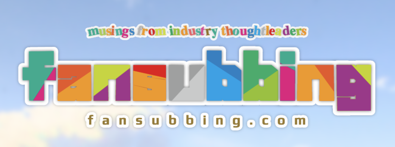
We opened the doors to fansubbing.com on April 8th, 2018, but if you do some sleuthing, you can find that the site itself was in the works for a good week prior to that. This meant buying the domains, setting up our blogging platform, and writing some introductory articles so the blog wasn't completely barren when it came time to open the site to the public. One of the last things we did, however, was come up with the site's logo.
Now, I'm not claiming to be a good logo designer or anything of the sort. (If anything, I'd call myself pretty bad at designing things in general.) However, I figured it'd be interesting to go through a bunch of my bad designs, and how we got to where we are today. Besides, y'all can take a look at some... questionable ideas that we had. In other words, if you think the site logo is bad now, you'll be in for a treat.
Also, fair warning: this post has a lot of photos. You've been warned.

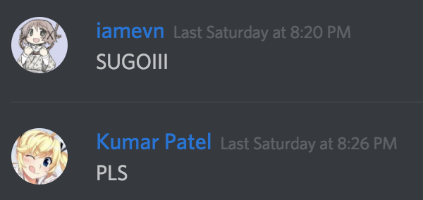
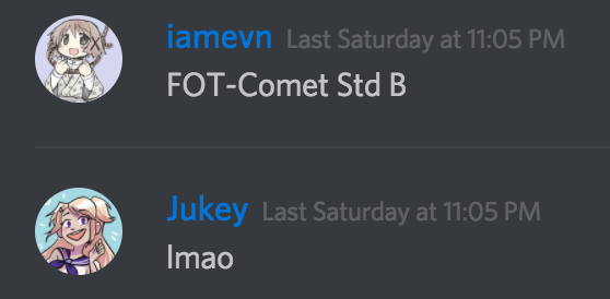
Yeah, "last Saturday" is talking about April 7th. Less than 24 hours before we opened the site, we were coming up with an ideas for the logo. We wanted to get the site live when new shows were premiering for the Spring 2018 season, so we had a quick turnaround.
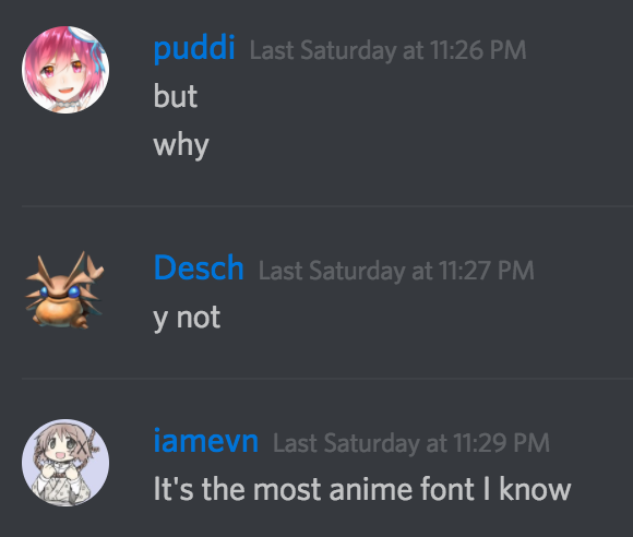
And so, when Desch suggested making an anime-style logo, I knew exactly what to do.

Unfortunately, this was met with neither praise nor approval.

Back to the drawing board, then.

The idea behind this one was to use a font that I personally really enjoy a lot (I used it for the Bemani Scrub Seattle cards), but have it masking some other text. The fonts used and the meaning of the text is left as a mystery for the reader.


I proceeded to ask some of our writers for font suggestions, and this next set came from Desch suggestion to use Helvetica as a font logo. I'm not sure why he made the recommendation, but here we were. The negative space going through the bottom was a play on the fact that "fansubbing" was talking about subtitles; the last iteration of this idea had a not-so-subtle reference to oldsub styling.
Things didn't feel like they were progressing, though. I wasn't happy with any of these logos. But then...


It was coming together. My first stabs at the logo were... not great.


I immediately knew that the font naturally lent itself toward having some kind of extended line that we could use as a unique flair for the logo. Unfortunately, having the f extended all the way made the name of the site look like "tansubbing", which sounds like a really bad salon name. As a result, we killed the extended f, but focused more on having an extended g.


Now we were getting somewhere. Having the extended g was more aesthetically pleasing, because it could play to the fact that it already had a descender (and it was the only letter in the name that did). At this point, we were committed to the underline; it was just finding the right way of implementing it with the rest of the logo.


I then tried detaching the underline from the g and—surprise!—it looked significantly better that way. I tried extending the f to match the descender of the g to make the logo feel more balanced, and there was a little back-and-forth on whether or not the line should stop at the left-side of the a, or if it should match the kerning between the n and the g on the right. Also, shoutouts to the fact that the g in the font had a different x-height from the rest of the letters.
That last logo was probably what we were going to roll with, if I wasn't bored at 2am and decided to do some exploratory stuff to see if it could get a little bit more interesting.


This is where the double line idea really took form and proved itself as a stylistic winner. It solved the problem that the single line had of leaving too much whitespace, and added a good bit of unbalance that made the logo stand out. That last one was basically the final design, sans adding a tint of color and fixing some the weird angles that the font had.

That's how we ended up with the current logo. Again, let me reiterate: I'm not a designer by trade, and I'm not a designer by hobby, either. Honestly, a professional designer would probably look at our logo and cry a bit inside. But it's an interesting trip down memory lane to see how the logo evolved into what it is today.
Questions or comments? Tweet us at @fansubbing! You can also follow us for updates on the latest articles, too.
