

It's not good.
Look, you may be on a site called fansubbing.com, but here at Fansubbing HQ we're big proponents of legal anime viewing. I've been a Crunchyroll Premium Member for the past 9 years, but recently their selection of shows has thinned due to competition from other streaming platforms. Normally this isn't too big a deal, as the times I watch anime in 2020 are few and far between (I mean, have you seen the post frequency on this site?). However, given the recent state of the world I've found myself with way more time on my hands, which means I'm turning to pastimes past and consuming more content. Some of that content isn't available on Crunchyroll, though.
Kaguya-sama: Love is War (Crunchyroll, S1 only / Funimation, S1 + S2) is a show that I watched and loved when the first season aired in Spring 2019. I knew it was getting a second season, but since Aniplex of America chose to give Funimation exclusive streaming rights for the new season, I wasn't aware that it was airing until five episodes had already been released. Begrudgingly, I whipped out the old credit card and signed up for a 14-day free trial for Funimation's premium membership, figuring that it would be a comparable product to Crunchyroll's and that paying for two months of Funimation would be worth it to get some more Kaguya-sama goodness.
What awaited me, though, was a thoroughly disappointing web application. For whatever reason, every part of Funimation's entire web experience leaves something to be desired, especially when compared to the competition. So, wielding the Judge title as made infamous by my colleague's MangaGamer post, let us dive deep into what makes this experience bad, what they could be doing better, and why this will probably never get fixed. You'll see a lot of comparisons to Crunchyroll's web product as that's what I'm used to, but the things I plan to point out aren't really matters of preference. There are empirical reasons for all of them.
Website performance usually boils down to two main things: a) how fast your website loads, and b) how fast your website responds to user interaction. A simple metric of performance is page paint time, or in other words how long a webpage takes from request start to actually rendering content in the browser. Google Chrome has an auditing tool that can analyze websites, do accessibility checks, check for best practices, etc. Now, check out this side-by-side comparison of the performance audits for both platforms' homepages.
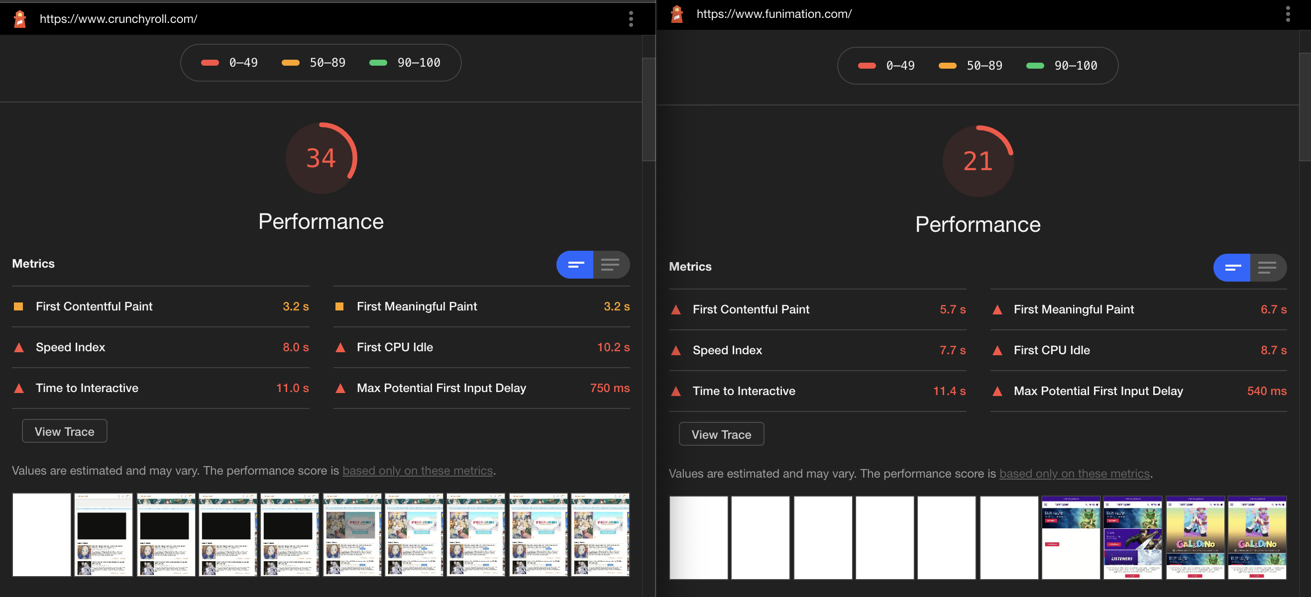
The metric we're looking at here is "First Meaningful Paint" in the top right of the table. That is the amount of time it takes for the webpage to render the primary content of a page. While both websites aren't great on the performance front (as evidenced by the low cumulative scores), Funimation's website takes over twice as long to load meaningful content (3.2s vs. 6.7s). We can see similar numbers on the search results page (CR: 3.4s vs. Funi: 5.4s) or a series overview page (CR: 3.2s vs. Funi: 5.4s). Overall, you're getting a noticeably slower experience while just loading the website.
Speaking of search: let's talk about how both products populate search results! Crunchyroll's web application uses something called front-end search. When you enter stuff into the search bar, your browser makes a request to Crunchyroll's servers asking for bare-bones data on every single item in their catalog. Then, when you type something into the search bar, your browser goes through each item, removes any items that don't match your search query, and then renders a list out of whatever remains. Here's how that looks in practice:
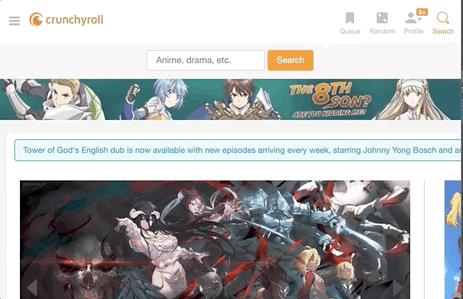
As most modern browsers and computers are relatively fast at sorting things, the biggest bottleneck to this approach is how long it takes to retrieve that master list of items. This is done in a request to an endpoint called https://www.crunchyroll.com/ajax/?req=RpcApiSearch_GetSearchCandidates, which takes about 120ms (or 0.12s) to finish. That's practically instantaneous response time - especially when considering the list doesn't need to get rendered until a character is entered - so this search experience feels fluid and responsive to the end-user. Since this master list of anime doesn't change that often, Crunchyroll can probably cache it every time it changes, resulting in these near-instant response times (because it doesn't have to calculate it over and over again).
Now, then! Let's take a good look at how Funimation does it!
Oh dear. That's... slow.
Funimation is using something called back-end search instead, which means that instead of your browser doing all the work in figuring out what matches your search query (in this case, "kaguya"), your browser effectively asks Funimation's servers, "Hey, can you tell me what y'all have for 'kaguya'?" by sending a request to https://www.funimation.com/pred-search/kaguya/. Both of these styles of search have their pros and cons, but Funimation's implementation takes about two seconds on average to get search results (.5s for debouncing keystroke inputs and 1.5s for the actual HTTP request). Going from instantaneous search to having to wait for search results is an extremely noticeable difference when going back and forth between the two platforms, and it doesn't work out kindly in Funimation's favor.
Well, let's continue our search journey on Funimation's website. After searching for the thing we're interested in and hitting enter, we'll be greeted with something like this:
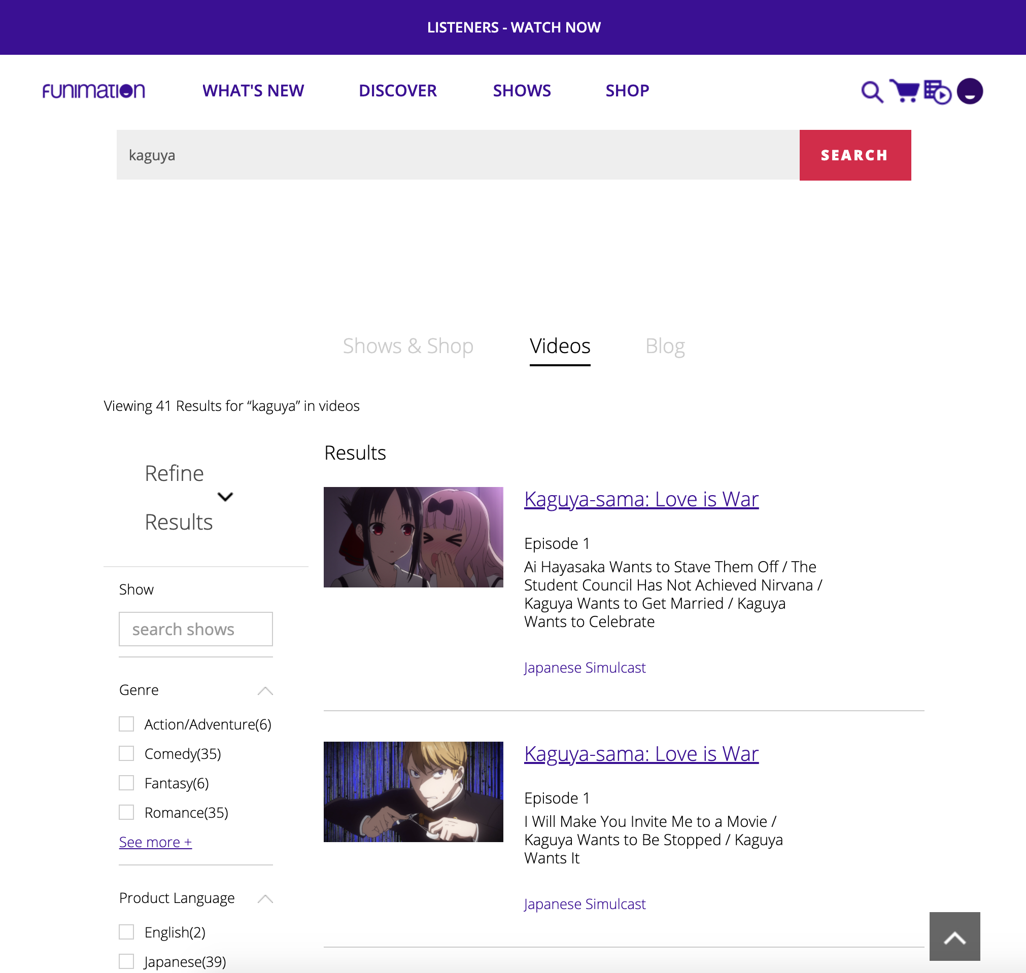
There's just so much to unpack here: the absurd amount of whitespace between the search bar and the results; the weirdly double-height "Refine Results" toggle on the left[1]; the lack of spacing between the tag name and quantity indicator in the checkboxes on the left; the fact that there are two "Episode 1" results without any indication of which is season 1 and which is season 2. All of these things create confusion and point to a significant lack of polish in the application. But all of these things are secondary to the primary issue I want to point out: the hyperlinks.
From this search results view, I see two links per search result item - one that says the series name (in this case, "Kaguya-sama: Love is War"), and one that says "Japanese Simulcast". Clicking the "Japanese Simulcast" link takes you to watch the episode, right?
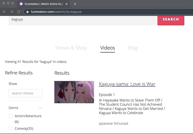
To actually get to the episode in question, you either have to click on the image itself or—and I hate this—click on the name of the series. Now, I can understand clicking on the image, since someone clicking an image of the episode presumably wants to actually watch it. What doesn't make sense, however, is how clicking the series name also takes you to the individual episode. I cannot fathom why Funimation decided to do this. It makes zero sense. And I'll provide an in-depth explanation of why exactly this feels so wrong.
Data modeling is an under-appreciated skillset that deals with the complexities of organizing data and information - how things are classified, how models link and relate to each other, etc. For instance, an album can be considered to be made up of multiple songs, or an invoice can be made up of many line items. These kinds of associations are called "one-to-many relationships" - you have one parent (an album or an invoice) that has many children (songs, charges). The analogy for us is how a singular anime series—the parent—can have many individual episodes—the children[2].
Why is this relevant? Well, architecturally speaking, that link's text is just the name of the series. It feels weird to click a link about a parent and be taken directly to one of its children. Nothing about the hyperlink says anything about the individual episode, and yet clicking it takes you there. If I'm browsing a cooking website, clicking on a link that says "Dessert Recipes" shouldn't take me to a recipe for banana bread, it should take me to a list of all the dessert recipes.
Bah, humbug. Enough about data architecture; we're over a thousand words into this article, so it's time to actually get to watching some anime. Clicking the link takes us to the player, which is a somewhat soothing sight for sore eyes.
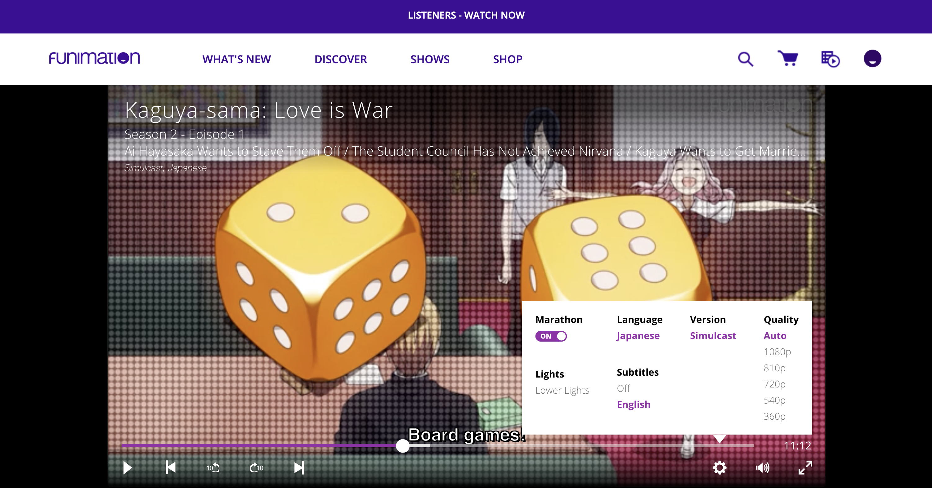
We've got a somewhat robust set of controls here: unified play/pause, back/forward an episode, and -10s and +10s, which are nice utility controls (CR mobile has them, but CR desktop does not). Of course, about a third of the time the back/forward buttons don't actually work - either by not being responsive or kicking you back out to the series overview page instead of doing their respective job. The settings pane is somewhat standard but there are two things worth pointing out. One, the "Marathon" toggle has no explanation on Funimation's website. Presumably, it's just an implementation of YouTube's auto-play button, but in my one time using it Funi inexplicably went from episode 2 to episode 4 (skipping episode 3) before I turned it off for good. I have no idea why the web player would do this, but it did.
The other thing to point out is the "Lights" feature. If you hit the "Lower Lights" button... the screen dims. Kinda.
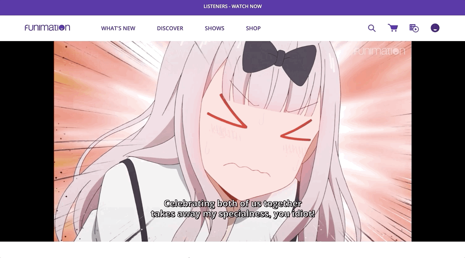
While the content below the player does dim out a bit, the header bar... changes colors. I'd argue that the header bar is more distracting this way, as it's now a solid 125px thick purple bar at the top that has zero spacing between the player. When it has a solid white background, the player feels properly positioned and distant from other content on the screen, but removing the spacing kills that. The purpose of a theater mode is to allow users to focus on the content and having a bar like that the top with white text is a jarring distraction, which is why I never used it beyond the first three minutes of trying.
Funimation also gives us an option for manually setting the quality (and it goes as low as 360p), so presumably, this should be a responsive web player that works on low screen widths to match the quality, right?
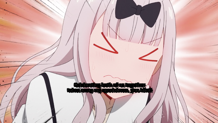
If you guessed "the border width of the subtitles doesn't change even when the font size changes," congrats!
Another thing to mention is the volume slider. Most HTML5 video players have support for granular audio levels (as they're just set as a number between 0 and 1 on the video itself), but for some reason Funimation's player[3] only lets you set the audio in 10% increments:
Just in general, not having the ability to set granular audio levels when the technology supports it is super annoying. If you're going to do it this way, then the UI might be better off reflecting it uses notches to indicate the stop points.
One last thing that I've noticed in my short few days with the website is that Funimation has a surprisingly large catalog of content that's available both in the original Japanese and also with the English dub. The player defaults to playing English audio (which I'm sure a lot of people have extremely good hot takes on), so changing the audio requires a trip to the settings pane. That's all reasonable, except for the following weird inconsistencies:
- Changing the language, then hitting "next episode" keeps your change
- Changing the language, then reloading the page resets your change
- Changing the language, then going back to the episode list and hitting the same episode again resets your change
The language appears to be determined by a query parameter attached to the URL (?lang=japanese), but it's not stored or saved anywhere... so every time you come back to watch a show you have to remember to change languages again if the default language doesn't work for you. Or you can go manually edit your settings in the account settings UI, which isn't explained to you at all beforehand.
Funimation's web product leaves a lot to be desired. The website feels slow and clunky, while much of it feels half-baked. There are minor things I didn't get into in this article, like some empty states and UI choices that look off, disproportioned, or otherwise go against best practices. Often times it feels like you're using a website that was designed and made in Microsoft Word.
It's definitely not trivial to build a video streaming service and I don't claim to be an expert in that. But there are some mind-boggling decisions at play here that make me think this web experience didn't get the love it deserved. It feels like a rushed, unpolished experience, one that has directly impacted my ability to find and access the content that I'm interested in.
Could Funimation fix these things? Yeah, sure, and they're probably easy enough changes to make. But that's obviously not where Funimation's heart is. Instead of investing in making their infrastructure and product better, Sony Pictures Television and Music Entertainment (owners of Funimation and Aniplex) have invested heavily in the content of their own ecosystem by keeping a show like Kaguya-sama exclusive to it. They're fighting the anime streaming wars with content, not product. To some degree this has been a success. I mean, the catalyst for me writing this article was me willingly signing up for their platform to watch the series. If anything it's proof of just how good of a show Kaguya-sama is. However, the product itself is so bad that I cannot see myself renewing this subscription after the show finishes airing.
I've heard similar complaints about Funimation's TV and mobile apps. It sucks because Funimation's catalog is honestly extremely competitive right now. I wish Funimation would invest more into polishing these things and making their applications better. After all, having a great catalog and lineup doesn't matter if getting to them is a huge chore.
1. This might be an artifact of loading the page at a small viewport width, then expanding it to a larger one, but the fact that the content is determined by the viewport width at first render time vs. dynamic UI based on width is depressing.
2. Technically, you're probably looking at a chain of one-to-many relationships: One anime series can have multiple seasons, and each season can have multiple episodes.
3. Their video player actually seems to be using a 3rd party library called Brightcove, which looks like an extremely... enterprise piece of software. I mean, what enterprise software would be complete without an FAQ section for Corporate Training, a support article on how to add a Facebook Like Button to their product, or code samples with somewhat questionable stylistic choices?
Questions or comments? Tweet us at @fansubbing! You can also follow us for updates on the latest articles, too.